Aqua Fort
Client: Aqua Fort
Country: Jeddah, KSA
Industry: NanoTechnology
Project Type: Corporate Identity
Country: Jeddah, KSA
Industry: NanoTechnology
Project Type: Corporate Identity
Scope of Work: Logo / Visual Identity / Packaging
About the project:
Aqua Fort is a nanotechnology spray that is used for water repellent and protection of different materials such as textile, glass, ceramic, wood, and metal steel.
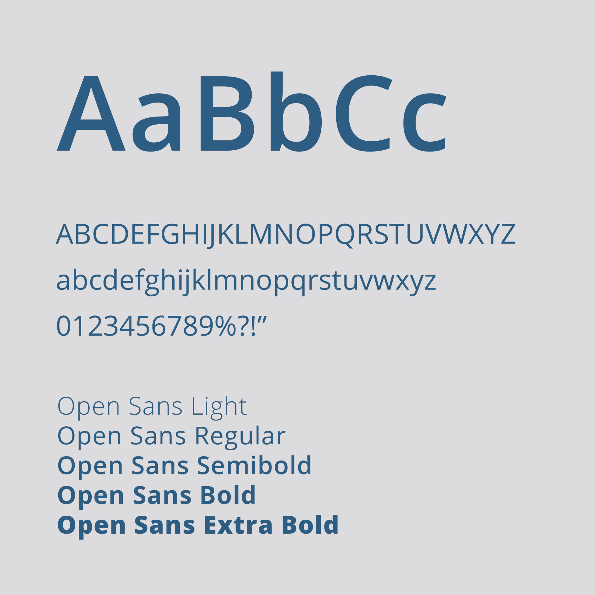
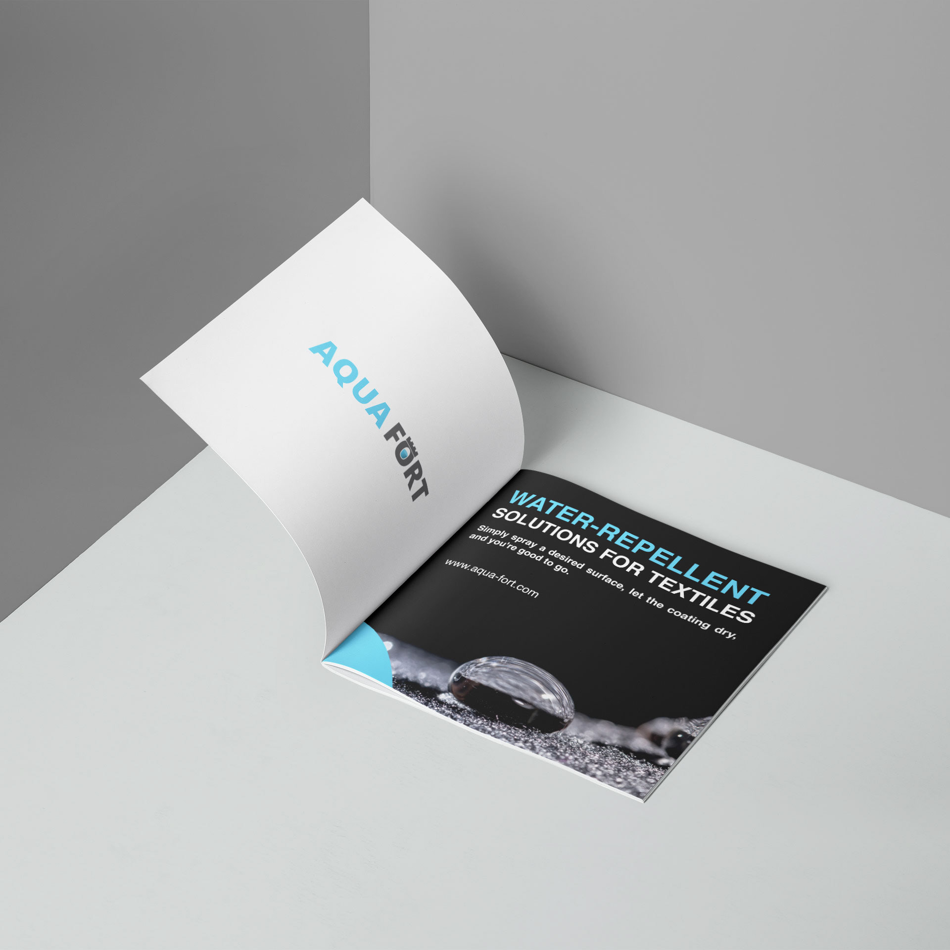
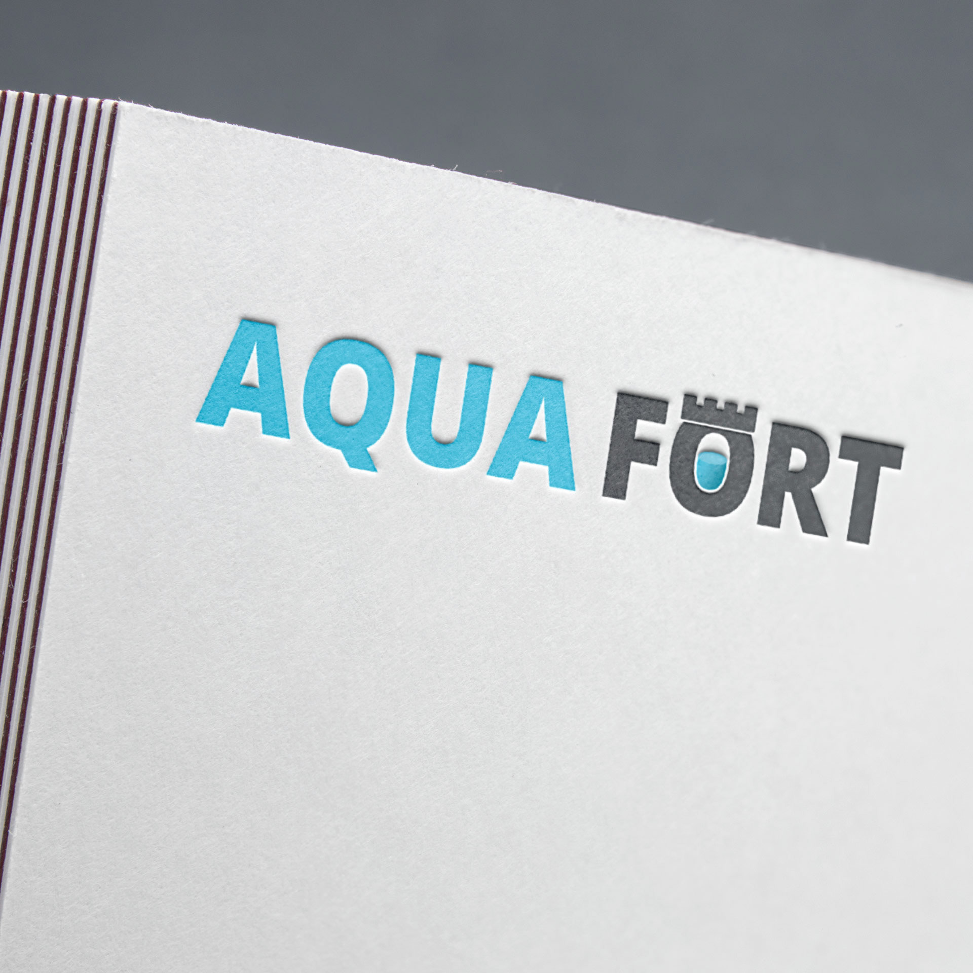
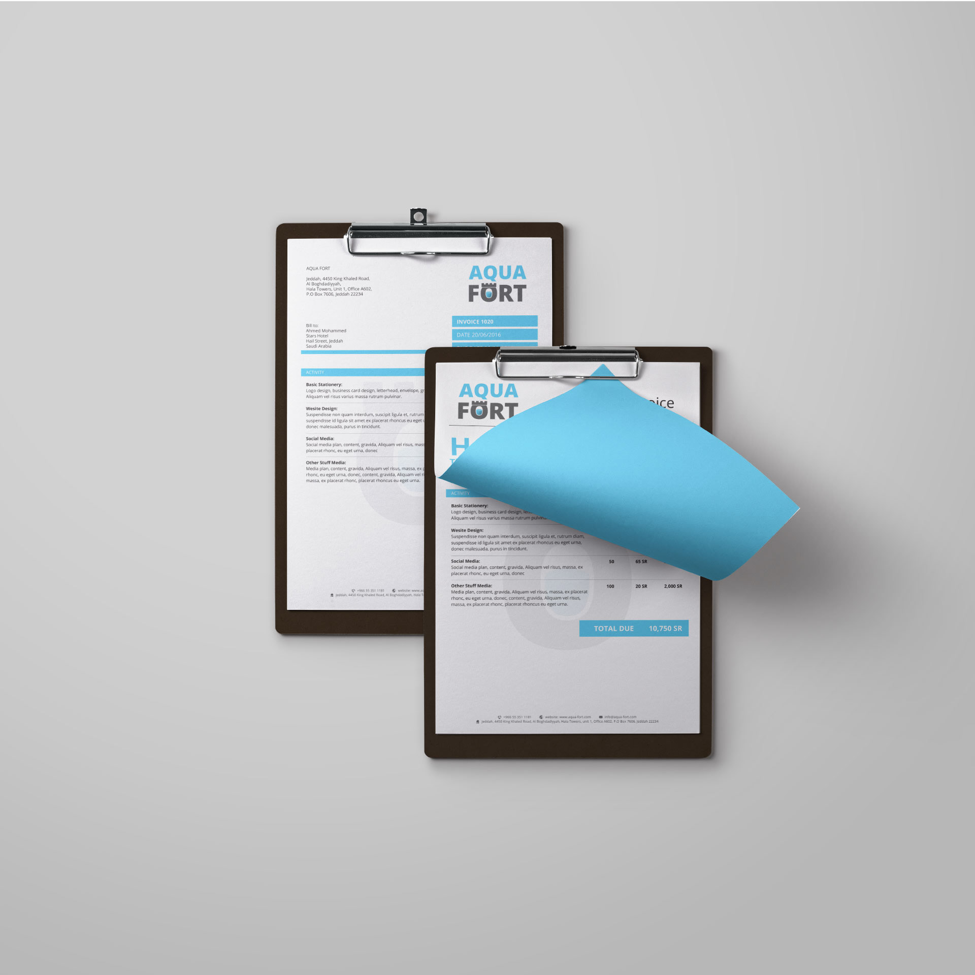
The client wanted an identity design where the design of the symbol was of great importance. The logo needed to work as a symbol to illustrate their main key benefit of the product. The intention of the symbol was to express the defence benefits of AQUA FORT line of products. Furthermore, the symbol has been used as a graphical element in printed matter to maintain consistency. The profile font and colour palette are all selected to emphasis on the key elements of these products.
The Problem
In our daily life, whether personally or in business needs. We deal with many types of surfaces like fabric / textile, metal and glass. The normal surfaces of these materials are exposed to dirt and water and that creates a problem in maintaining them clean. Surfaces are supposed to feel good to the touch and to look good for as long as possible, be easy to maintain and not be spoiled by dirt, water stains or fingermarks.
The Solution
Non-polar molecules that repel the water molecules are said to be hydrophobic; molecules forming ionic or a hydrogen bond with the water molecule are said to be hydrophilic.
With this technology, we can protect many materials from rust, dirt, wetness and increase the lifespan of these materials. That is where Aqua Fort with its nanotechnology comes to help.
The Concept
AQUA means “Water” in Latin. Combine it with the Fort which is perceived as the protection/ defence “Repellant”, and you get the Fort that repels water. The logo illustration is playful and memorable.
In this industry being a defence is the very foundation of their products. Effectiveness is a necessary addition. What makes AQUA FORT unique is the advanced Nano-Technology that is not only applied on one surface or material but on many.
The Implementation
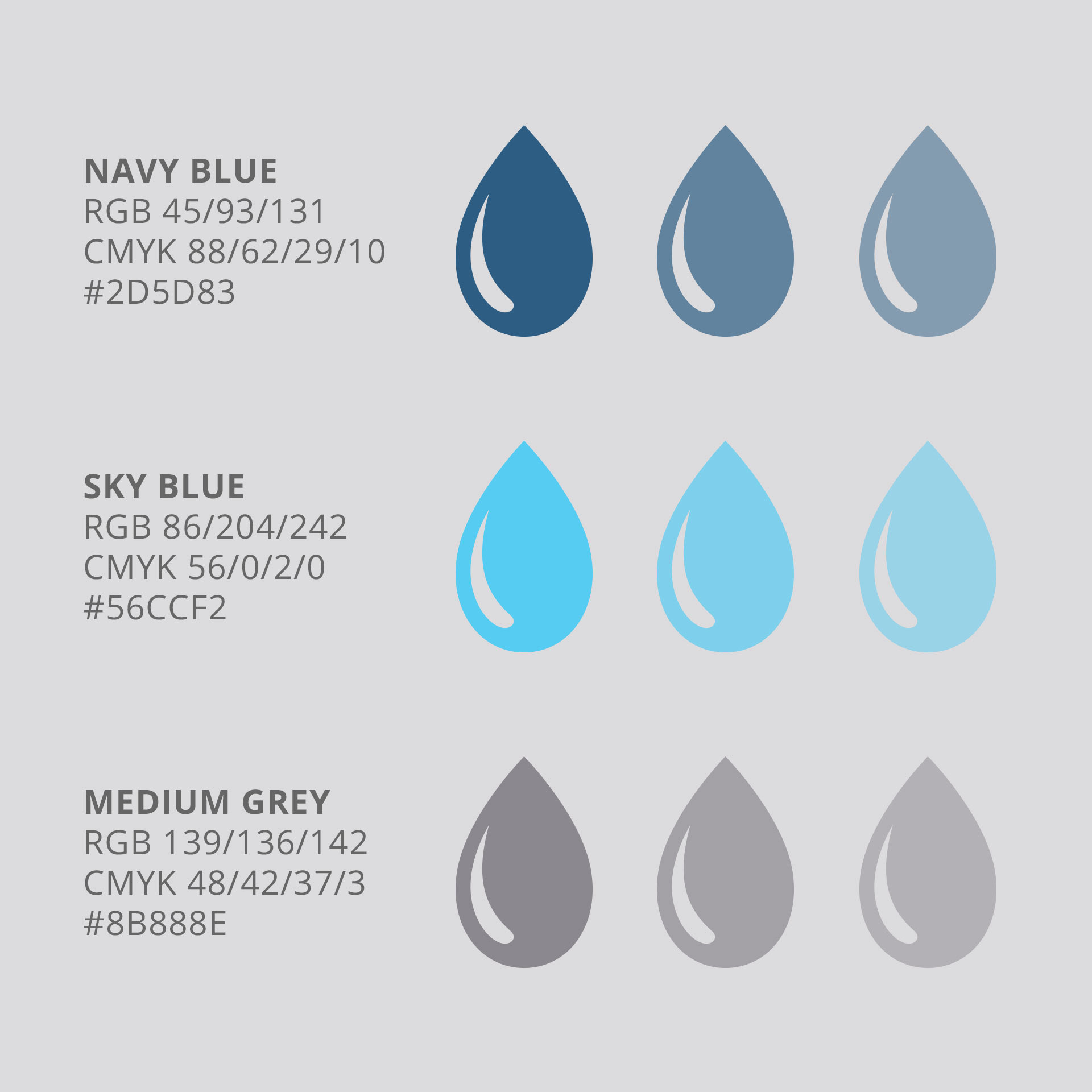
Use of both black and blue colors proves the brand not only environmental aware, but aims to stress the benefits of the water repellent of AQUA FORT products.
Credits
Agency/ Studio: InspireTBB Design Studio
Art Direction: Ayman Al Amoudi
Graphic Design: Salem Kaadan
Copywriting: Ebtesam Al Masaabi
Art Direction: Ayman Al Amoudi
Graphic Design: Salem Kaadan
Copywriting: Ebtesam Al Masaabi
See the project on our website
